Movies & TV / Columns
Comics’ Best Alternate Looks Part 2: Wolverine, The Flash, More
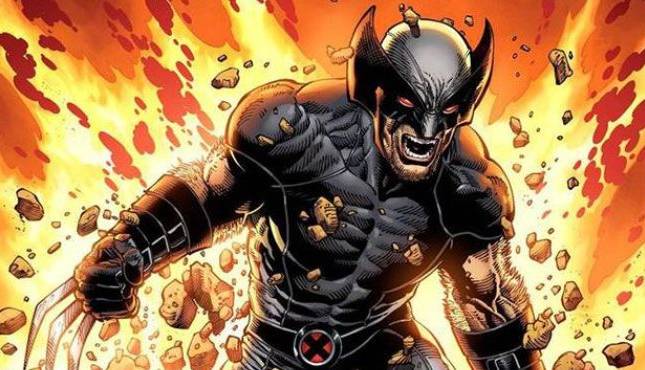 Image Credit: Marvel Comics

Welcome back! This is part two in a [X]-part series in which I look at the best outfits superheroes have worn when they weren’t in their usual attire. Like us, heroes have to keep their appearance fresh, and no matter how classic a look is, change can be good!
When last we convened, there may have been some consternation that I considered Terry McGuinness, Miguel O’Hara, and Alan Scott’s basic looks as “alternate” designs for Batman, Spider-Man, and Green Lantern respectively. To be fair, it’s true that, say, Peter Parker probably hasn’t worn the Spidey 2099 get-up, but Miguel is a character who went by the name “Spider-Man”. So, come on… it’s close enough for me!
If you take umbrage to those kinds of picks, you can shoot me back a copy of your best looks for these heroes using whatever standards you like. I’d be thrilled to see them! Maybe you remember some costumes I have long since forgotten.
I’ll be honest as we go on through some more redesigns: you are going to find out I generally have horrible taste. I am a huge fan of bright, garish colors, and I dig when there is a cacophony of design going on. If my wife would let me, I’d paint every room in our house a different neon color. It would be so rad.
I mentioned last week how much I hated the generic Green Lantern costume. It’s just so… “blah”. And why is a space cop wearing something so skimpy and skintight? It’s boring and unbelievable. It’s supposedly “classic”, but I don’t care for it.
So bear all that in mind!
Let’s get into it this week and see some more great style.
Wolverine is a character who has had some distinctive looks over the years, but his typical get-up, the yellow-and-blues that he’s spent most of his comic life in, never really seemed to fit him. The guy is a harass, grizzled, bitter killer. He’s been train in stealth by Eastern martial arts masters. And… he’s running around in a bright yellow body suit?
It pops on the page, but it’s just so glaringly out of character. Why would he want to stand out? Why wear such a sunny, cheerful color to begin with?
He was eventually given a look that really fit the character, though.

Logan’s black-and-gray X-Force duds (with murderous red eye lenses!) make a lot more sense for a trained assassin who isn’t a cheerful fellow. They blend into shadows, and those eyes really convey just how screwed you are when this guy’s on your trail. He really should suit up in this uniform regularly.
His mustard outfit, the standby yellow-and-brown, isn’t bad either, and I always thought that was a better look than the blue. He wore that one for a good long time, too, and growing up I thought that was his standard forever.
The Flash is a guy with a fairly consistent look, and unlike his buddy Hal Jordan, the classic Flash design is fitting and well-made. He looks fast and sleek, and the lightning patterns and colors really make him look exactly how he should. I know I said I lean away from some classic designs that are really vanilla, but I think The Flash’s look is perfection. It’s simple, but the colors and the flairs are bold.
But he’s had some changes over the years. Wally’s current Rebirth outfit with the hair cut-out isn’t bad. Hell, in theory, Bart Allen was The Flash for a spell, so the Impulse costume could count here, and I have had an affinity for that. Jay Garrick and his metal hat… none of these are bad looks.

But for me, brief as it was, the Blue Lantern Flash was a great design. The lightning bolt overplayed on the Blue Lantern logo with that whole “projection” effect they started doing with the chest emblems when Hal came back? Perfect.
Look, I’m going to take some guff for my pick on Thor. I’m not saying it’s the best Thor look–Thor’s classic costume is so striking and grand for him–but I’m saying it beats out a lot of the alternatives.
I grew up reading comics in the early 1990’s when EVERY two-bit character got their own title because #1 issues were going to make us all rich. One of those two-bit characters that I actually thought had a really interesting book and was taken from us far too soon was Thunderstrike.

IT’S SO 90’s! That jacket and the ponytail, and the chains, and whatever those boots are supposed to be. It’s like a relic preserved in amber. But you know what? Tell me you would piss off that guy. Sure he’s a 90’s fever dream, but I would give a dude looking like this the widest birth possible.
He doesn’t have the regality of Kirby’s Thor, but he’s not a god; Thunderstrike is just a guy. It’d be weird to put him in a flowing cape (Eric had issues with the cape when he was Thor anyway) and a novelty helmet. This is a dude with the power of a god who is just a busy architect in his day-to-day life. I buy this look.
As a runner up? Modern Age Thor with the chain-mail looking sleeves isn’t bad. To be frank, most of Thor’s other get-ups have been pretty much clown shoes. Give me Kirby Thor, Thunderstrike, and maybe Modern Age… everything else shouldn’t have made it off the scratch pad.
She’s had a lot of names over the years, and to go with those, Carol Danvers has had an awful lot of wardrobe changes. It doesn’t feel like it given the heights of popularity she has hit, but she hasn’t really been in her modern Captain Marvel identity and uniform for a particularly long time. Maybe a decade?
It’s probably her best look overall. It’s dignified and bright and colorful, and it gives her a real feel as Marvel’s Superman, which is a role she should have been handed ages ago instead of being reduced to being an X-Men background character, secondary Avenger, and–sometimes–a drunk.

The Warbird costume is a bit skimpy to hang your hat on as “this is our star character”, but damn… it’s a great costume. The red sash provides a distracting flair of color, the lightning bolt is a great symbol, and honestly? It’s just a sexy look. Incredibly memorable. It doesn’t fit who Carol is now, but it was still a wonderful design.
If there’s a runner-up to be had, it’s her original Binary form. It’s just so wildly different from the rest of her looks. It gave her a proper presence as a cosmic hero who deserved to be soaring the space ways and stopping intergalactic predators like The Brood.
Jean Grey is another Marvel heroine who has undergone many name changes and alternate looks to match. You know what… I’m not even sure what you consider Jean’s “base” look. She’s never worn any one costume for all too long.
She’s had various Phoenix looks, her original Marvel Girl get-up, the original X-Factor design, the 90’s Gold Team suit, the Grant Morrison black gear, and whatever Hickman has her in now. Those are just off the top of my head!
So in a world where Jean has had nothing but alternate looks, anything should count, right?
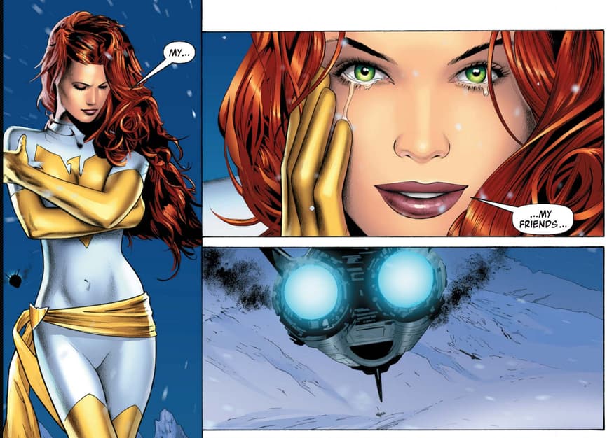
Not that anyone was going to confuse Jean’s White Phoenix (I always called it Life Phoenix) look as her base anyway. But the stark contrast between her flowing red lockes and the white costume is powerful, and it gives her the most striking of all the great Phoenix color schemes.
Also, I apparently really love women’s costumes with a sash.
So that’s five more heroes and their looks down. What do you got? What are the best alternate costumes for Wolverine, Flash, Thor, Captain Marvel, and Jean Grey? Let me know in the comments! And if there are any characters whose looks you want me to pick from in the future, throw out a suggestion. I’ve been sticking to heroes, but there are some great villains with rotating uniforms, as well!
Until next time… take care!


