Movies & TV / Columns
Comics’ Best Alternate Looks Part 3: Magneto, Aquaman, More

I’m still at this!
We have done this twice before at this point (Exhibit A and Exhibit B), and I can’t stress this enough: I love alternate get-ups. I am the guy that, when I get a video game where the hero can unlock or earn various costumes, I will NEVER use the default look again.
The Spider-Man PS4 game absolutely spoiled me for this. What an embarrassment of riches all of those unlockable costumes were. Wasn’t that game noteworthy for introducing the Big White Spider look? Never used it. I mean, the Scarlet Spider hoodie and 2099 garbs were RIGHT THERE.
Obviously, nothing pleases me more in comics than a bored creative team. They slap a new look on a popular character to sell toys, and I love it. Change for the sake of change is often lazy or uninspired, but sometimes it can be a home run.
So, for third time, let’s take a look at some more comic characters who have had multiple apparels over the year and see what their best non-standard look is!
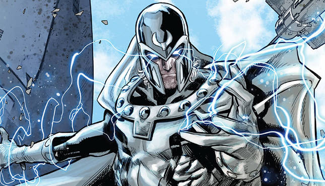
Magneto, the sometimes-hero, sometimes-villain of the X-Men–and man, Erik Lensherr switches alignments at a pace that makes WWE’s The Big Show say “Slow down and really feel yourself out already!”–has a pretty snazzy base look. If you don’t believe me, just look at Jim Lee’s cover for X-Men #1. That is sharp and unforgettable.
But he hasn’t always worn that. Hell, in the 1980’s, he had, like, a purple-ish get-up with a big M on his torso. That is… not what I’m going with. That was not a very good look. He didn’t even have a helmet then!

For starters, I love anything drawn by Chris Bachalo. So maybe I’m biased.
But while this look might not be as defining as Magneto Cola Classic, it’s still potent. Not just the colors, but in the narrowed face of his helmet. It may not be practical for seeing peril, but that much face cover juxtaposed against the solid white… it’s the story of Erik’s life. Is he a hero or a villain? He is a beacon or is he hiding his truth? Even his costume is confused!
I’ve done Hulk, Iron Man, Thor, and Captain Marvel. Captain America… maybe I’ll get to, but the pickings there is so slim. But a classic Avenger I haven’t delved into yet is Hawkeye.
Typically, the Avenging bowman wears a very silly costume that has a Wolverine-like cowl with an H on it, and some too-skimpy-for-a-street-leveler purple duds. It’s fine. It’s memorable. But to find Hawkeye’s best look, you have to go to his best book…

Okay, I can’t REALLY count that. It’s basically just a shirt he is wearing briefly. BUT! It’s a full alternate version of the character in the mobile game Marvel Puzzle Quest, AND it was my Halloween costume one year (complete with bandages) when we had an Avengers themed party.

But no, okay. For realsies, we will go to the actual costume that Fraction and David Aja gave Clint for that series:
It’s less goofy and heroic. It carries more of a “hunter in the shadows” vibe. The shades are a sharp touch. And it has kind of an emblem without being anything over the top. It fits the character better (especially Fraction and Aja’s iteration of the character).
You want to know what the easiest call of all-time on alternative looks is? Aquaman. Aquaman’s best look is certainly not his standard appearance. I mean, baby-faced blonde with a sparkly orange top and green tights? Do you think he would have become the “he is useless and talks to fish” butt of jokes if he didn’t look like such a geek? I mean… he would still talk to fish, but that’s way more useful than BATMAN. But Batman’s look is aces, whereas Aquaman has all the coolness of soggy cereal.
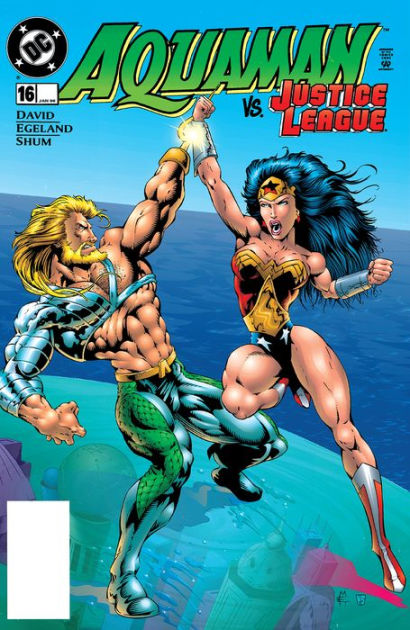
Now THAT GUY is no joke!
Peter David took a perennial joke of a character and gave him a grizzled new look. Throw in some metal! Give him a hook hand! Grow out his hair and beard! Now he talks to the fish AND can fuck up your day!
(Seriously, he could. They also decided in that era that talking to fish meant he could explode the part of your brain that evolved from sea life. Because why not?)
Is it a bit “Of Its Era”? Sure. It screams 1990’s “trying to be cool”. And yet, it’s still 1000% better than base Aquaman. It’s befuddling to me that they have long-since abandoned this look in favor of clean-shaven Aquadork again.
Honestly, go back to the 1930’s and 1940’s. Switch up Aquaman and Batman’s designs, and Batman would be the loser on the Super Friends. “What’s he going to do? Throw boomerangs at crime? Haha, what a jabroney. Get the badass who can summon sharks in there!”
Dr. Doom is another villain like Magneto who has undergone a bunch of different looks as he has swayed allegiances over the years. Make no mistake, Victor Von Doom has never been anywhere near as purely heroic anywhere near as often as Magneto, but he’s oftentimes… well, “nuanced” would be a good way to describe it.
And like Spider-Man, Doom is impressive in that his standard design is so powerful and memorable, it’s amazing that he has had so many other guises that almost rival it. God Emperor Doom. Doom 2099. The Infamous Iron Man armor he wore when he was making a concentrated go at goodness. But for my pick, I’m going a bit off the board, though I will explain.

HE MADE AN ARMOR OUT OF THE SKIN AND ORGANS OF HIS BELOVED! I mean… Doom 2099 is rad and a great runner up, but he’s just wearing metal! Doom made a deal with some demons to enhance his magic, and all he had to do was murder the only woman he ever loved and turn her squishy parts into his new clothes.
(Now I kind of want a Doom/Buffalo Bill mashup of Victor wearing this, looking in the mirror, and saying “Would you serve me? I’d serve me”).
Even aside from what the armor is–and that’s a BIG thing to put aside–this is an outfit that has such a creepy vibe to it, being all stitched together and emblazoned with demonic symbols. In the hands of a darker artist who didn’t have the cartoony style of that book, this would be incredibly dire. Even in that flavor, it still comes off as terrifying.
There have been a dearth of Robin looks over the years. Tiny shorts. Full tights. Boy versions. Girl versions. Red Hoods. Red Robins. Drakes (ugh). Would Nightwing count as a Robin look? Shit, if so, I’m second-guessing my pick now.
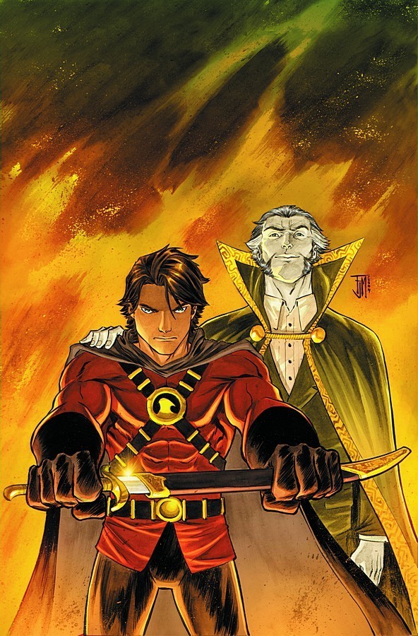
The black-and-blue Nightwing look is dynamite, and I kind of want to rule it out to make room for Tim Drake’s Red Robin look from near the end of the Post-Crisis/Pre-Flashpoint era. If you want Dick’s solo career look to count, you can consider it a co-winner.
Tim’s look has all the makings of “Robin”–it is red and yellow, he still had Robin in his name–but it was also something that belonged to him. It replaced much of the green with black. He had a cowl instead of a Lone Ranger mask. He made a new emblem. It was the best mixture of keeping his roots while striking out on his own and letting Damien take up the sidekick gig.
Terrible name, though. Truly awful. How did they even think naming him after a restaurant chain was a good idea? He should have moved over to Marvel and taken up Ruby Tuesday as his arch-nemesis.
All right, that’s another set down, and I am still just getting started. Think of the X-Men! Even having down Wolverine and Jean Grey already, I could probably do two full volumes of this series of JUST X-Men! They have more outfits than I have regular clothes.
In the meantime, let me know two things. First: what are your picks for these characters? And second: what characters do you want to see me choose a best look for that I haven’t done yet?
Until next time… take care!


